


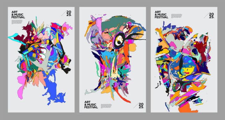
The Deftones’ Unique Album Covers
 Story by:
Music Blog
Story by:
Music Blog
Although the Deftones began in Sacramento, California, in 1988, they have developed into a genre all their own, with millions of fans. As of now, they are an alternative band with 9 albums out. There has been a lot of talk about their music, and we felt it was time to properly look at the album covers of the band. That it’s the individual effect of each album cover is really quite remarkable. It’s not the kind of pictures that we’re used to seeing. They each work seamlessly with the rest of the band’s aesthetics and give the album a solid, complete feel. In music, a visual look is often part of the listening experience and is associated with an artist or band’s first impressions before they are ever heard for the first time. Let’s look at the covers of Deftones’ albums in order and see what we can learn.
Adrenaline (1995)
The Adrenaline album is Deftones’ debut album. The cover is very basic and monochromatic, making it somewhat disturbing and utterly unappealing. It’s hard to see exactly what it is on the cover, but at first glance, we can’t tell. What I get given is similar to those photographs whose purpose is to trip the mind, to make it go ‘okay, what now, what now?’. What this spindle-like object is is not clear.
The make becomes just as hazy in the background and hard to get a read on as the object’s color is pale and lung colored. At the same time, it fits wonderfully in terms of the theme of the album, almost as if, before they announce a new album, the band was already setting a tone through pure visual ambiguity, and it sticks as a perfect match with the ambient, raw, and rough atmosphere of the music world.
Around the Fur (1997)
The illustration on the cover of Around the Fur is a girl in a swimsuit that looks like she’s wearing the most ridiculous swimsuit I’ve ever seen, but before all this becomes a generic cover reference, I guess I should explain that the illustration is not the “thirst trap cover” I’d been expecting. The second album is more down-to-earth than the very light-hearted debut album, and the cover photo is no exception. To be honest, the pool scene image is one of the band’s most iconic album covers – it says a lot without even a word, it talks about a state of mind, an emotion.
White Pony (2000)
The aesthetic sensibilities are often lone, and this often minimalist style is one that’s become trademarked by the Deftones in their music and even in their looks. This is nicely shown on the cover of White Pony, which also uses a monochromatic theme. A galloping white horse’s body is depicted in the 2D style on the album. Just so happens, this is one of my favorite Deftones covers, and is one of the most iconic images of the 2000’s alt metal scene.
Deftones (2003)
Now in the cover for Deftones, the album’s first album entirely game to the simple line art style, they instead do something not too different than the style used by Breaking Benjamin or Three Days Grace. There are red and blue roses in the background, which almost seem to be in the same plane as the skull, but still, this X-ray-inspired skull might actually belong right on an Ed Hardy T-Shirt. The album had a darker, heavier tone, and a similar attempt was made with the cover art. In our view, not very successfully.
Saturday Night Wrist (2006)
Just as the logo is important for Lemon Casino, so too is the choice of album cover for a band. Of course, Deftones isn’t Lemon Casino, and there’s no resemblance between Lemon Casino and the Sacramento-based band. Saturday Night Wrist also features a foggy and mysterious cover, like a double-exposed photo. On the right side, there is a woman with her head tilted back, with just a part of her face visible. It’s a fitting theme for the sensual, emotionally rich musical landscape that the album offers. The very moment we catch a window of the cover, we fall into a dream-like floating sensation, and the music is beyond our wildest dreams.
Diamond Eyes (2010)
Everyone knows this white owl with the ‘Diamond Eyes’. A very basic cover with a creature (white owl with outstretched wings) in the center. The cover of the Diamond Eyes album is a favorite among many fans, along with its being a detailed, clean design, because it’s mystical and serene. Its sense of visual restraint is what makes it so attractive – at the opening of the first track, it immediately creates an ambiance which brings the listener into the album’s world.
Koi No Yokan (2012)
What the album’s name translates to, Premonition Love, is like a warning. The name of the album translates to Premonition Love, which is like a warning, and there’s a somewhat dark image on the cover of the album. The photo shows a futuristic scene with a green and orange color palette, featuring a red door in the center of the image. It is a grainy-looking filled as if with water, rain, or precipitation from some artificial water fountain. The concept theme is not only used on the cover, but it’s also reflected in the album itself.
Gore. (2016)
Cover of Gore is probably the busiest Deftones cover, second in busyness only to Deftones’ album cover. On Gore’s, dozens of flamingos are flying. No central theme, and an overall impression is the focus. Color also has great significance. The pink flamingos with the gray background give a very calm impression, and there is indeed dynamism here, but it didn’t stand out. The cover is like a snapshot of the present and will stay that way for the future.
Ohms. (2020)
Once again, conceptuality is dominant in the works of Ohms. Amongst all the grey scales of the pixels, there appear to be a pair of staring faces with their eyebrows drooped, and a face that looks worn out. We can only guess at the face, because absolutely nothing can be discerned from it. What gives away that some negative emotion resides beneath the surface is the arching of the eyebrows and the faint smudges of makeup in the eyes. This is a geometric design and grey base pattern giving the cover a steel effect, which makes it un-touchable.
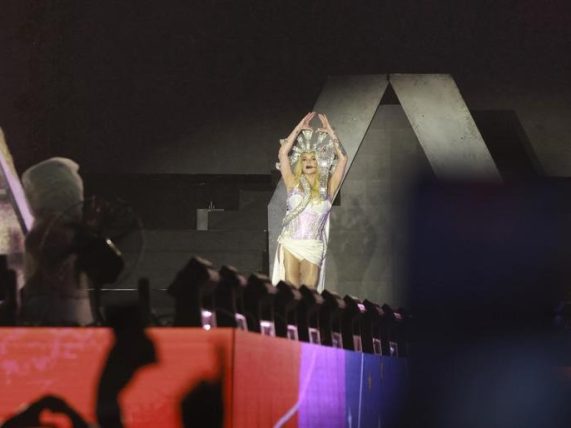
Like a song’s atmosphere that makes more of itself in the music than words, much of the artwork invites interpretation rather than straightforward explanations and enhances the sense that the album isn’t there to reveal answers, nor is it quite a straightforward gala; similarly, the live music scene often carries its meaning through mood, presence, and texture rather than direct statements. Like an atmosphere in a song that yawns out more in its music than in its words, much of the artwork here invites interpretation rather than straightforward answers; it adds to the sense that the album isn’t a straightforward gala, and perhaps answers don’t need to be directly offered.


Comments 0
No Readers' Pick yet.