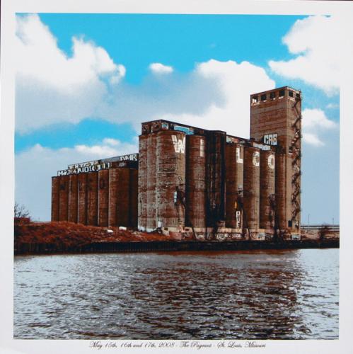
I have a nasty habit of taking photographs without people in them. In fact, I prefer landscapes, plants, and especially buildings. Truth is, people can ruin pictures sometimes. Maybe one person isn’t looking, or another closed their eyes. Some might see these imperfections as human, something to be lauded in photos as opposed to eradicated. I usually do not.
This is probably why Dan MacAdam’s work appeals to me so much.
Just like my taste in photos, I concede that it is possible that others might have different tastes in gig posters. There are a lot of fantastic artists making beautiful illustrations of gorgeous women, of sailors, cowboys and musicians. And somehow I still wind up stunned when Dan comes out with another print of a dilapidated building.
It is not just the images that fascinate me, though I do generally love Dan’s choice in buildings. Many artists have screen printed photographs before, usually to middling effect. Dan’ prints are like a subtle celebration of the medium. Viewed from a few feet away and you would swear they were actual photographs. Take a few steps forward and you’ll have a new found respect for the art of separations.
Every screenprint involves seps, where each layer of color that comprise the image is separated out. When starting with an illustration made for three colors that can be easier. When creating separations from a photograph, that task can be incredibly difficult. Even Dan’s bigger prints still only involve six or seven colors, I honestly don’t know how he gets the refined detail out of that few colors.
It’s true that I’m a big fan of everything Dan puts out, but his latest poster for Wilco’s three night stand in St. Louis is above and beyond. I love the sky, and “Wilco” blends in so seamlessly with the enormous factory. And I think there’s something in the water; it absolutely shimmers. I don’t know how Dan selects the images to go with the bands, but they usually seem to work, and I think it definitely does here.
So what do you think? I’ve posted Crosshair posters in the past. Are you as enamored with this one as I am. And are you cool with posters devoid of humans, or do you need a personal touch?


