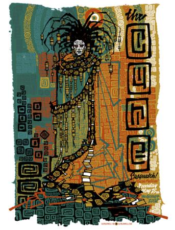
I was mulling a few options for Print Tease this week. Then gigposters had an update and I had a clear cut winner, Guy Burwell’s poster for The Cure. I couldn’t care less about the band, but I couldn’t be more excited for this poster, I think this is the best print I’ve seen in a while.
Every year the Sasquatch festival in George, Washington organizes a really cool series of posters for every band playing the festival. There are usually one or two gems that come out of the group, and I think the competition in 2008 is over. Guy is the winner.
This print is unmistakably Guy’s work, his geometrically constructed characters are immediately recognizable, but this takes everything a step further. I love the color palette. The greens, blues, reds and golds all come together in a bit of harmonious chaos.
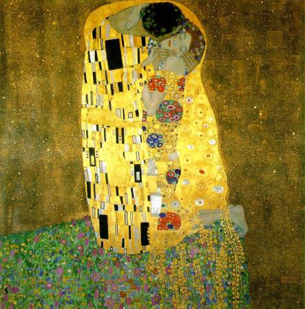
Cure front man Robert Smith is the unmistakable centerpiece of the print. Rendered here in a kind of tribal glory, the whole composition feels like an homage to the famous Austrian painter Gustav Klimt. Check out Klimt’s masterpiece The Kiss below. I’d be hard pressed to find the same strong symbolical elements in Burwell’s poster, but in the color scheme, the geometric shapes, and the way the body of Robert Smith blends into its surroundings you can see the similar styles.
This print also reminds me of another recent trend I’ve seen in the poster community recently is in this mosaic style of construction. Todd Slater has definitelymastered the style. But where Todd’s images come together with precision, Guy’s mismatched tiles make up a design uniquely his own.
Honestly there is nothing I don’t like about Guy’s latest, and I think it’s definitely the cream of the Sasquatch crop. But take a peak at the rest of the series, and let me know if you think anything tops it.


