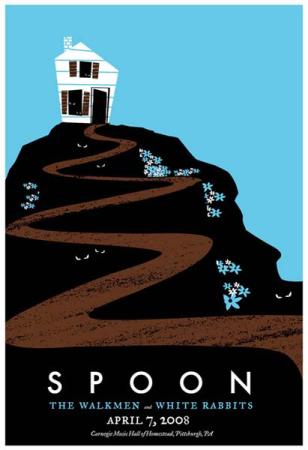
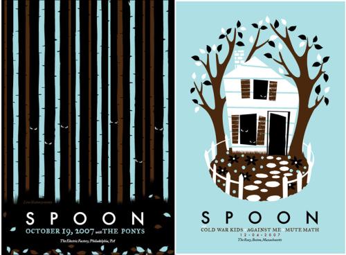
By all accounts Spoon are a pretty good band to work with. That’s probably why they’ve had a number of posters done for them — a lot of really good posters. Everyone from Aesthetic Apparatus to Todd Slater to The Decoder Ring have tried their hand at the Spoon gig poster, but the evil eyes of this week’s Print Tease keep catching my own.
Pittsburgh artist strawberryluna is the one behind this mini-series, and the most recent of which was for last week’s gig in the Steel City.
This is an interesting exercise in poster design to me. When I saw the first poster I immediately loved the imagery. The evil eyes peering out of the birch trees really captured me. I wasn’t so sure it fit with the bands music (though perhaps it was based on the title of their second album Series of Sneaks). Todd Slater used similar imagery for a Decemberists poster a little while back, and I actually thought it worked better for them at the time.
What’s really interesting to me, though, is how strawberryluna has gone back to those evil eyes two more times, and has effectively branded Spoon with them. I no longer need to see Spoon across the bottom of the poster; I already know who is playing. This type of branding doesn’t always have an opportunity to happen. Artists don’t often get a chance to do multiple posters for a band, and often don’t repeat motifs when the do get the opportunity. But I think it can be very successful.
I do wonder if this type of mini-branding is effective to a wider audience. The evil eyes were used on three posters for three different cities, and unless you’re a poster fanatic like me (or now a LMB reader) you’d probably never see all three posters and pick up on the repetitive imagery. It would just be a poster with evil, enticing, well…eyes. But even if you didn’t know the context, it would still be a very cool poster.
What do you think? Do the evil eyes fit Britt Daniel and Co.’s music? Would you like to see more mini branding (or not-so-mini branding) for other bands?


