 A while back, Kane told me that my site looked like garbage on a mobile device (in a nice way, mind you) and I just now got around to fixing it. I’m not a big mobile technology guy — I probably will be soon as it’s starting to peak my interest more and more every day — but I never put too much weight on the fact that people need to read the Live Music Blog while out and about…
All that has changed.
Introducing…Live Music Blog MOBILE!
If you’re using a mobile device to hit the www.livemusicblog.com, you’ll automatically be redirected to a stripped down version of the site with the full HTML content that the post contains (this might require some more testing, but for now, that’s how it’s setup). What to know how I did this? Read on for my mini tutorial…
GET YOUR SHIT TOGETHER | a Live Music Blog tutorial
How to create a well-functioning mobile version of your blog/site
1. Set-up the mobile address of your site — While this is slightly redundant and not necessary based on Step 3 below, it’s always good to have a domain ready to go for your new site segment. I’ve registerd mobile.livemusicblog.com and m.livemusicblog.com — makes sense to me.
2. Create a stripped-down version of your site that mobile browsers can handle — Thanks to FeedBurner’s handy BuzzBoost tool, this is extremely easy. If you’re a FeedBurner user, hit your “Publicize” tab and click on the BuzzBoost button on the left hand sidebar. Check a couple key options here: Display Feed Title (I’ve changed mine to Live Music Blog // mobile), Display Item Content, Display Subscribe to Feed Link (always a smart thing to do) and click “activate.” This will create a JavaScript snippet that will allow you to easily create a mobile index page. Note: I’m a FeedBurner user** so this is my preferred method but there are a huge handful of many other sites that will do something similar for you.
Create a standard text document ripe will all of the basic elements of an HTML page — tags for html, head, title, and body should be there — and insert the JavaScript code between the body tags. Upload this as “mobile.html” or “mobile/index.html” to your web server and test this baby out by hitting “yourdomain.com/mobile.html.” — do you see a less graphic, CSS-intensive version of your site? If yes, good, let’s move on. If not, sorry, but I’m not sure I can help you more.
3. Setup an automatic mobile device redirect to your mobile page — Inserting one simple block of code onto your .htaccess server file makes this extremely easy, also…
RewriteEngine On
RewriteCond %{HTTP_USER_AGENT} “Windows CE” [NC,OR] #Windows CE and Pocket PC
RewriteCond %{HTTP_USER_AGENT} “Opera Mini” [NC,OR] #Opera Mini
RewriteCond %{HTTP_USER_AGENT} “NetFront” [NC,OR] #PalmSource WebBrowser 2.0
RewriteCond %{HTTP_USER_AGENT} “Palm OS” [NC,OR] #Eudora Web Browser for Palm
RewriteCond %{HTTP_USER_AGENT} “Blazer” [NC,OR] #Handspring Blazer Browser
RewriteCond %{HTTP_USER_AGENT} “Elaine” [NC,OR] #RIM Devices
RewriteCond %{HTTP_USER_AGENT} “^WAP.*$” [NC,OR] #WAP Browsers
RewriteCond %{HTTP_USER_AGENT} “Plucker” [NC,OR] #Plucker Offline download client
RewriteCond %{HTTP_USER_AGENT} “AvantGo” [NC] #AvantGo Service
RewriteRule ^index\.php http://www.livemusicblog.com/mobile/index.html [L,R]
Change the bold in Step 3 to your schema in Step 2 and re-upload your .htaccess file to the root of your blog/site web directory.
4. Enjoy!
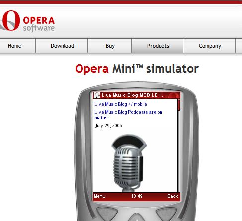
Again, as I’m not fully turned on to a lot of mobile technology yet, I’ve got to do a poor-man’s test of this page by visiting Opera Mini’s demo site. Go ahead — type in livemusicblog.com and see what happens.
I should note that it took me a hell of a lot longer to actually write this up than it took to implement. Give it a test spin yourself and drop hints/comments on how this works for you. Word.
INFO: Pocket PC Thoughts
** – Full disclosure: I’m also a FeedBurner employee. Technically, this has no relevance to this tutorial but I just thought I’d remind everyone of this. :) **